Design systems that travel across formats
Strong graphic design for modern brands begins with a system, not a one-off layout. When a business appears at a trade fair, ships a product in premium packaging, and promotes the same offer online, the visual language needs to stay recognisable in every setting. That means building a consistent framework for colour, typography, spacing, icon style, imagery and tone, then adapting it intelligently for each channel.
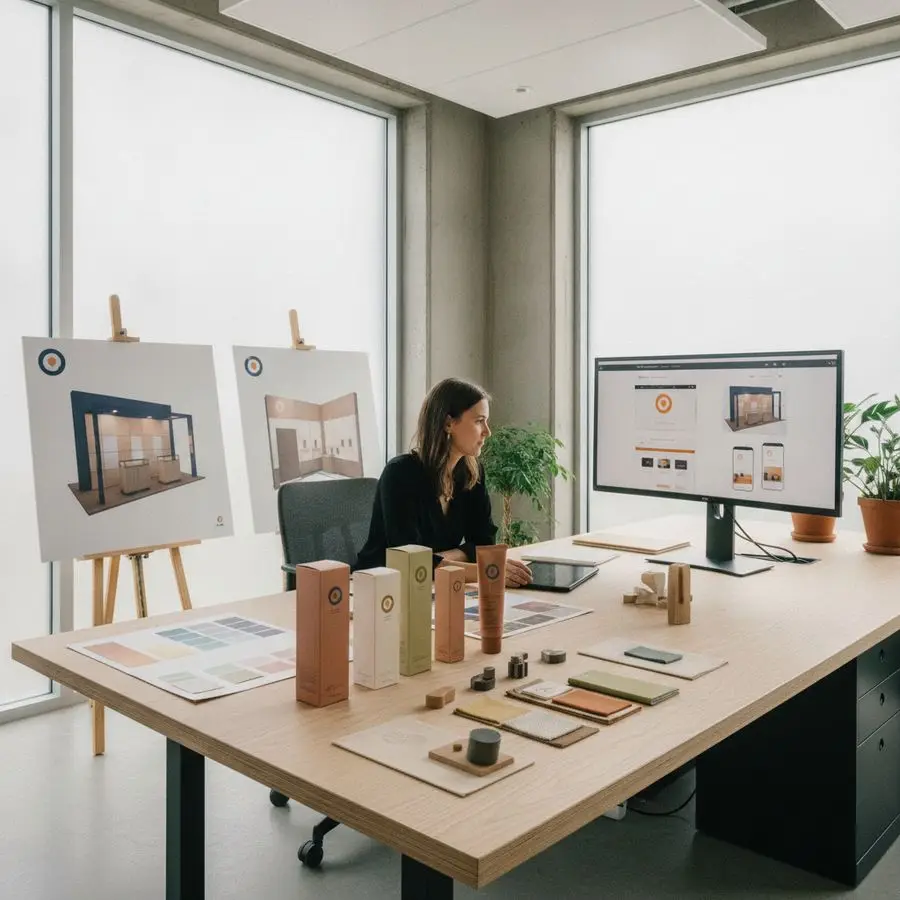
A flexible design system helps brands avoid the common problem of looking polished in one place and disconnected in another. A stand backdrop may need large-scale impact, while a carton panel needs regulatory clarity and a product page needs screen-friendly hierarchy. The goal is not to repeat identical layouts, but to preserve the same identity across different surfaces and viewing distances.
Consistency builds trust faster than novelty when buyers meet your brand in multiple places.
In practice, an effective system for trade show design, packaging design and web graphics usually includes:
- a defined colour palette with print and digital values
- type rules for headlines, body text and callouts
- image treatments that keep photography or illustration aligned
- grid logic for large displays, labels and responsive screens
- usage guidelines that protect clarity and brand recall
This is where experienced creative direction adds value. Rather than redesigning from scratch every time, you create a visual structure that can scale, simplify production and keep the brand credible from exhibition hall to shelf to website.
Exhibition stand graphics that guide attention
At a busy event, visitors do not read an exhibition stand the way they read a brochure. They scan, glance, compare and decide within seconds whether to approach. Effective trade show design therefore depends on visual hierarchy: what people notice first from a distance, what confirms relevance at mid-range, and what supports conversation when they step closer.
The strongest stand graphics use bold focal points, disciplined messaging and clean composition. A large brand mark or product image can attract attention, but the supporting design must quickly answer three questions: who you are, what you offer, and why it matters. Too much text weakens impact. Too many competing elements create confusion. Good graphic design makes navigation intuitive.
It also helps to think in zones. High-level messaging belongs above eye line, benefit-led statements work well at eye level, and detailed information is best placed near counters, displays or demo areas. This structured approach supports both foot traffic and sales conversations.
Stand graphics should not decorate space; they should direct behaviour.
Useful priorities often include:
- one clear visual hero instead of several competing images
- short benefit-driven headlines that can be read at a distance
- colour contrast that improves legibility under venue lighting
- directional elements that lead visitors toward products or staff
- modular layouts that can be reused for different stand sizes
When planned well, exhibition graphics do more than look attractive. They increase dwell time, improve message retention and turn a physical stand into a practical brand experience.
Packaging details that support premium pricing
Premium products rarely rely on price alone to signal quality. Buyers often judge value before they ever use the product, and that judgement is heavily shaped by packaging design. Materials, finishes, structure, spacing and copy density all contribute to the perception of care, expertise and trustworthiness.
One of the most effective ways to support premium pricing is restraint. Crowded panels, inconsistent typography and weak colour choices can make even a good product feel ordinary. By contrast, a controlled layout with balanced whitespace, refined hierarchy and tactile finishing can elevate the entire offer. Subtle details often do the most persuasive work.
Premium packaging also has to perform practically. It should protect the product, communicate clearly and feel coherent with the wider brand system. If the website promises sophistication but the box feels generic, the customer experience loses momentum. This is why strong creative direction links shelf presence with the rest of the brand journey.
People do not just buy the item inside; they buy the confidence created by the presentation.
Details that commonly strengthen premium perception include:
- carefully chosen paper stocks, coatings or textures
- precise logo placement and disciplined use of whitespace
- high-contrast typography for clarity without visual clutter
- colour palettes that feel distinctive rather than decorative
- structural packaging that improves opening and handling
Good graphic design on packaging does not need to shout. It needs to look intentional, consistent and worthy of the price attached to the product.

Web visuals that strengthen brand recall
Online, attention is fragmented and competition is one click away. That makes visual consistency essential. Well-planned web graphics help visitors recognise a brand quickly, remember it after they leave, and reconnect it to what they saw on packaging, social media or an exhibition stand. This continuity is a major advantage in markets where trust is built over several touchpoints.
Brand recall online depends on more than a logo in the header. It is shaped by recurring visual cues: a stable colour system, recognisable image direction, consistent button styles, clear typography and page layouts that feel familiar from screen to screen. Repetition, when used thoughtfully, creates memory. Inconsistent design creates friction.
Strong digital visuals should also support performance. Oversized decorative graphics, weak contrast or cluttered interfaces can reduce clarity and hurt conversion. Effective graphic design for the web balances identity with usability so that the site not only looks right, but works hard.
A memorable website is rarely the loudest one; it is the one that feels instantly recognisable and easy to use.
To improve recall through design, brands often benefit from:
- signature visual motifs repeated across banners and landing pages
- consistent product imagery and cropping rules
- button and icon styles that reinforce the same visual language
- responsive layouts that preserve hierarchy on mobile devices
- campaign graphics adapted for ads, email and on-site content
When web graphics align with packaging design and trade show design, buyers experience one coherent brand rather than disconnected marketing assets. That coherence improves recall, trust and response over time.
Print specifications that prevent costly errors
Even strong concepts can fail in production if technical details are ignored. In print, small mistakes become expensive quickly, especially for exhibition panels, labels, cartons and promotional materials produced at scale. Good graphic design therefore includes a rigorous understanding of specifications, not just aesthetics.
File setup matters from the start. Dimensions, bleed, safe areas, resolution and colour mode all need to match the final application. A web-ready asset cannot simply be enlarged for a stand graphic. Likewise, a packaging file that ignores dielines, folds or barcode placement can delay production and create waste. Technical accuracy protects both budget and brand reputation.
There is also a strategic side to print control. When artwork is prepared consistently, suppliers can quote more accurately, revisions become easier to manage, and campaigns move faster across formats. This is particularly important when combining trade show design with packaging design under one launch schedule.
Production discipline is part of creative quality, not separate from it.
Key specification checks typically include:
- CMYK or spot colour selection based on print method
- correct bleed and trim allowances for each format
- image resolution suitable for viewing distance and size
- font embedding or outlining to avoid substitution issues
- dieline, varnish and finishing layers clearly separated
Reliable creative direction anticipates these issues before files reach the printer. That reduces rework, limits unexpected costs and ensures the final result looks as strong in real production as it did on screen.
Creative direction from campaign to shelf
The most effective brands do not treat campaigns, stands, packaging and websites as separate design exercises. They approach them through shared creative direction. This means defining the visual idea, message priorities and customer experience once, then carrying that thinking through every execution from launch campaign to shelf presentation.
For example, a product launch may begin with a campaign concept built around innovation, craftsmanship or sustainability. That concept should then influence exhibition graphics, sample kits, pack structure, landing pages and digital ads. Without that central direction, each item may look competent on its own but fail to reinforce the others. Buyers notice the gap, even if they cannot name it directly.
Integrated thinking is especially valuable for smaller businesses that need every marketing asset to work harder. A coherent brand system reduces duplication, improves production efficiency and makes future rollouts easier. It also strengthens recognition across international or bilingual markets where consistency can support credibility.
When every touchpoint tells the same visual story, marketing becomes easier to remember and easier to trust.
Good end-to-end direction often brings together:
- campaign concepts translated into physical and digital formats
- shared visual rules for stands, packaging and web assets
- content hierarchy aligned with buyer intent at each stage
- production planning that avoids redesign during rollout
- brand guidelines that support long-term consistency
In short, strategic graphic design is not only about making things look better. It is about connecting trade show design, packaging design and web graphics so the whole brand performs more effectively in the market.