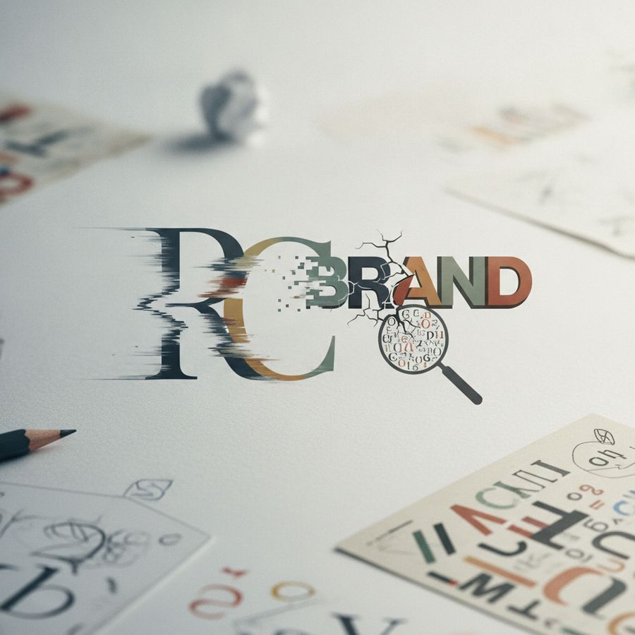
Overview of logo design and longevity
A strong logo design does more than look attractive in the moment. It becomes a durable visual asset that supports recognition, trust, and long-term positioning. When a brand logo is built for longevity, it can work across years of campaigns, product launches, digital updates, and market shifts without feeling tired or irrelevant. That is why good logo design is less about decoration and more about strategic clarity.
Many dated identities begin with a simple mistake: the logo is created to satisfy current taste rather than long-term use. A business may choose a fashionable symbol, exaggerated effect, or trendy font because it feels modern today. However, if the design lacks structure, distinctiveness, and relevance to the company’s values, the wider visual identity will age quickly. What feels fresh now can soon signal that the business has not evolved.
Longevity usually comes from restraint. Clear forms, balanced proportion, thoughtful color use, and typography that remains legible over time all contribute to a more resilient brand image. For businesses investing in brand identity, the goal should be to create a mark that adapts across digital and physical media while staying recognisable.
A lasting logo is not the one that follows the moment most closely, but the one that communicates clearly when the moment has passed
In practice, this means evaluating whether a logo can support growth, new services, changing platforms, and audience expectations without losing its core meaning. A timeless logo design helps protect the brand image from becoming visually outdated before the business itself is.

Why trend chasing dates visual identities fast
Trends can be useful reference points, but they are a weak foundation for a lasting brand logo. When companies chase what is popular on design galleries or social media, they often end up with identities that look familiar rather than memorable. Gradients, ultra-minimal symbols, geometric shortcuts, or retro nostalgia can all work in the right context, but copying a trend rarely creates a distinctive visual identity.
The problem is speed. Design trends move much faster than business strategy. A logo that leans heavily on a fashionable style may look current for a year or two, then begin to feel tied to a specific period. Once that happens, the logo stops reinforcing confidence and starts suggesting stagnation. This is especially risky for companies that want to appear established, reliable, and strategically led.
Trend dependency also weakens differentiation. If competitors are using similar icons, similar palettes, and similar typography, customers have fewer visual cues to remember your business. Recognition drops, and the overall brand image becomes easier to confuse with others in the market.
- Trends should inform execution, not define the concept
- Distinctiveness matters more than fashionable styling
- A logo must still make sense when current design tastes change
The strongest approach is to design from brand fundamentals: audience, positioning, tone, offer, and use cases. A selective nod to current aesthetics can be appropriate, but it should never overpower the strategic role of the logo design. If a logo only works because the style is in fashion, it is already on borrowed time.
Scalability tests for websites packaging and print
One of the clearest signs of weak logo design is poor performance across real applications. A logo may look polished on a presentation slide, yet fail when placed on a mobile website header, shipping box, label, brochure, social profile, or exhibition graphic. Scalability is not just about size; it is about maintaining clarity, recognition, and technical usability in every environment where the brand logo appears.
Digital-first businesses often discover this issue when a detailed logo becomes unreadable on smartphones or favicons. Print-led businesses see the opposite problem when a logo designed for screens reproduces badly on packaging, signage, or merchandise. Fine lines disappear, complex gradients flatten poorly, and small typography turns illegible. These practical failures directly affect the customer’s experience of the wider visual identity.
A reliable identity system should be tested before rollout, not after problems appear. Useful scalability checks include:
- Viewing the logo at very small sizes for mobile and social icons
- Testing black-and-white versions for print flexibility
- Checking contrast and legibility on light and dark backgrounds
- Applying the logo to packaging, signage, stationery, and digital layouts
- Ensuring symbol and wordmark variants work independently if needed
These tests help protect the brand image from inconsistency. A logo that scales effectively feels more professional because it behaves consistently wherever customers encounter it. Good design is not proven by a mock-up alone; it is proven by performance across real-world touchpoints.
Typography choices affecting recognition and recall
Typography is often underestimated in logo design, yet it plays a major role in how a brand is remembered. The right type choice can make a business feel credible, modern, expert, premium, or approachable. The wrong one can make the brand logo feel generic, difficult to read, or stuck in a past era. Because typography carries tone as well as information, it has a direct impact on recognition and recall.
Many dated logos rely on fonts that were chosen for novelty rather than durability. Overly decorative scripts, compressed sans-serifs, or typefaces strongly associated with a specific decade can age a logo quickly. If customers struggle to read the name, or if the typography feels disconnected from the company’s positioning, the entire visual identity loses coherence.
Recognition improves when letterforms are distinctive but legible. Small adjustments in spacing, weight, alignment, and custom detailing can make a logo more memorable without compromising clarity. This is especially important in crowded sectors where many businesses compete for attention using similar naming and similar visual shorthand.
Typography should not simply display a brand name; it should help fix that name in the customer’s memory
Well-considered typography also supports future growth. It works across websites, packaging, presentations, advertisements, and printed materials without constant correction. When evaluating a dated brand image, typography is often one of the first elements worth reviewing. A careful refinement, or in some cases a broader logo redesign, can significantly improve both professionalism and recall.
When a logo refresh makes business sense
Not every ageing logo needs a complete logo redesign. In many cases, a strategic refresh is enough to improve clarity and relevance while preserving recognition. The key question is not whether the logo feels old internally, but whether it is limiting how the market perceives the business. If the current brand logo undermines credibility, creates inconsistency, or no longer reflects the company’s offer, a refresh may be justified.
There are several business-driven reasons to update a logo design. A company may have expanded into new markets, shifted from local to international audiences, modernised its services, or moved heavily into digital channels. In these situations, the original identity may no longer support the required perception. A refresh can sharpen the visual identity without discarding brand equity that customers already recognise.
- The logo performs poorly on digital platforms and mobile devices
- The design looks inconsistent across packaging, print, and web use
- The business has evolved beyond its original positioning
- Competitors now appear more current and differentiated
- The logo no longer reflects the desired brand image
A thoughtful refresh should solve defined problems rather than introduce change for its own sake. Sometimes that means refining typography, simplifying a symbol, improving spacing, or adjusting color. In other cases, deeper structural issues call for a more comprehensive logo redesign. The right decision depends on strategy, not taste alone.
Conclusion and criteria for stronger logos
A dated logo rarely becomes a problem overnight. More often, it gradually weakens the business by reducing clarity, differentiation, and perceived relevance. Over time, customers begin to associate an outdated brand image with an outdated offer, even when the company itself is capable, experienced, and competitive. That is why better logo design should be judged by performance, not just visual preference.
Stronger logos usually share a few core qualities. They are distinctive enough to be remembered, simple enough to function across media, and appropriate to the brand’s market position. They avoid overreliance on short-lived trends and use typography, color, and form in a disciplined way. Most importantly, they fit into a broader visual identity system that can support websites, packaging, print, presentations, and future growth.
When reviewing a current brand logo, useful criteria include:
- Is it recognisable at a glance and at small sizes?
- Does it reflect the business accurately today?
- Can it work consistently across digital and print applications?
- Does it feel distinct within the competitive landscape?
- Will it still look credible in several years, not just now?
If the answer to several of these questions is no, the issue may not be aesthetic at all. It may be strategic. Whether through refinement or a fuller logo redesign, improving the logo can strengthen trust, consistency, and long-term brand value. A better logo supports the business quietly but powerfully, every time the audience sees it.